Blog May 9, 2018
Avoiding Edward Tufte's information pitfalls to Data Visualization


- Topics
- Data & Analytics
CapTech recently attended Edward Tufte's one-day conference Presenting Data and Information in Atlanta, Georgia. Tufte is a visionary and pioneer of data visualization - It was an honor to be in the same room with the 'Galileo of Graphics'.
Throughout the day, Tufte emphasizes TRUTH above design, software, cosmetics, consistency, marketing, and current trends. He does not glorify data visualization technology, dashboards, or little data graphics. Just because we can design complicated and fancy reports, does not mean we should.
In order to maintain truth, we should avoid four pitfalls: Chart junk, Confusion, Overload, and Number Panic. They are over-engineered, distract from, or distort data. As dashboard developers, if we can identify information pitfalls, we can discipline ourselves to design better. They can be subtle and are not always intentional. Features and functionality should never distract from data integrity.
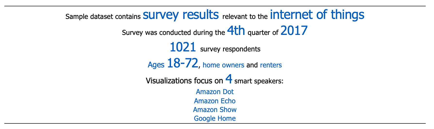
Using sample survey data from an Internet of Things Consumer Study CapTech is currently conducting, we built several pairs of visual examples for each Tufte no-no: the first chart in each pair will identify the pitfall, the second is a serving suggestion to remedy.
But first, let's introduce the sample data using a Tufte concept, the data paragraph. The data paragraph below is intended to display information with thoughtful design and a simple layout.
Now let us identify and remedy four data display pitfalls.
1. Chart junk - components that take away from or do not directly contribute to information. Clutter includes duplicate grid lines, labels, over use of color.
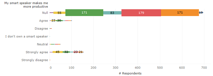
Serving suggestion
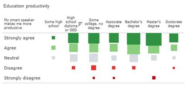
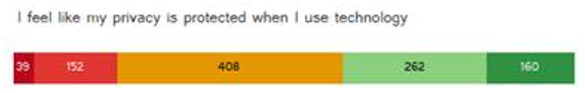
Sort data logically least to most education. Use intuitive stop-light colors display the range of Strongly Agree to Strongly Disagree. Tufte recommends using gradients of color. Relative sizing enables visual comparison.
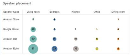
2. Confusion - any elements that are not intuitive. Objects or features that distract, or worse, misleads the audience. Obscured data marks, disproportionate axis.
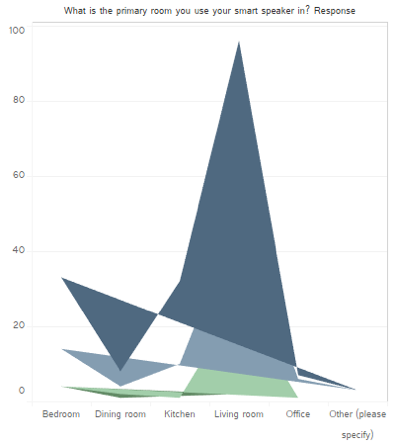
The foremost dark blue triangles mask other data points and block comparison. Colors are subtle, but it is not clear where one color stops and another starts. Y-axis is not labeled - does this visual indicate that there are 100 living rooms?
Serving suggestion
Proportion, categories, and quantities are clearer. Values are sorted to quickly identify Amazon Echo speaker in the living room is the most popular combination within this data set.
3. Overload - Too much of anything. Axis labels, data point labels, 3D visuals
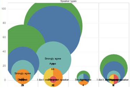
Data points overlap and mask each other. It is not clear to which value the label applies. Across the bottom, the quantity of respondent label could 'axis-dentally' be mistaken for axis labels. Also, there are pie charts.
Serving suggestion
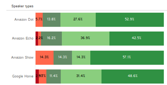
Sort values and categories logically and size by quantity enables comparisons. Colors are intuitive and gauge sentiment. In contrast, red-green colors can imply positive or negative associations, be mindful of using them with categories.
4. Number panic - display extreme values, without context
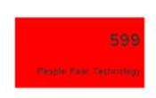
Serving suggestion
599 people out of how many total? Show color and categories to describe the range of responses. Show perspective and context.
In closing, Edward Tufte is intellectual, slightly irreverent, and highly entertaining. His examples abstract and timeless. The shift away from technology was an adjustment for me. As a dashboard developer, I use technology to analyze, extract, and display data. Just because we can pepper in fancy features, does not mean we should.
Regardless of software, I challenge you to embrace Edward Tufte concepts and avoid the pitfalls when displaying information. Every day with each story, good dashboard design is Tufte to do

